Want to go back to my other projects?
Symbols evaluation of garment features
Client
Distancify/Didriksons
Spring 2024
Role
UX/UI Designer
Tools
Figma / Photoshop
Research methods
Cognitive Walkthrough
Usability testing
User analysis
Prototyping
Project overview
As part of a project for Distancify, I collaborated with three other students to evaluate how users interpreted the feature symbols for waterproofness, warmth level and breathability on Didriksons’ website. Using a mix of cognitive walkthroughs, usability tests, and interviews, we identified key challenges and insights. These findings formed the basis for targeted improvements that made the icons clearer, more usable, and easier to understand.
Building on these insights, we proposed concrete design enhancements to make the website more intuitive and accessible. The solutions not only improved the overall user experience but also helped Didriksons communicate product information more effectively, with the potential to increase both customer satisfaction and sales.
Process
Target group definition and cognitive walkthrough
We identified key user traits such as an active outdoor lifestyle, technical proficiency, fashion awareness, and pragmatism. These insights formed the basis for detailed personas representing the target audience. Using these personas, we conducted a cognitive walkthrough of the website. The team assumed different roles (facilitator, note-taker, product expert, and evaluator), rotating between them in different rounds. The scope was on the journey from the homepage to the feature icons, including filtering options and the interpretation of the symbols.
Problem identification and requirements
Four main issues were ranked by severity (cosmetic, minor, major, and critical). Requirements and goals were then defined, for example, how many participants needed to understand the icons without clicking “read more.”
Usability testing and analysis
Five participants completed four scenario-based tasks while thinking aloud. Observations and semi-structured interviews were used to capture their emotional reactions both during and after the sessions. We compared findings from the walkthrough and usability testing to confirm existing issues, uncover new obstacles and to understand why certain features and design choices worked better or worse than others.
Design mockups
Mockups were created using Figma and Photoshop. Several iterations of icon design and element placement were developed, primarily by returning to the analysis to refine and connect the pieces more clearly. For each design, we asked ourselves how it would specifically support users in their interaction with the website.

No “close” button
There is no “close” button in the dropdown menus.
Severity: Cosmetic
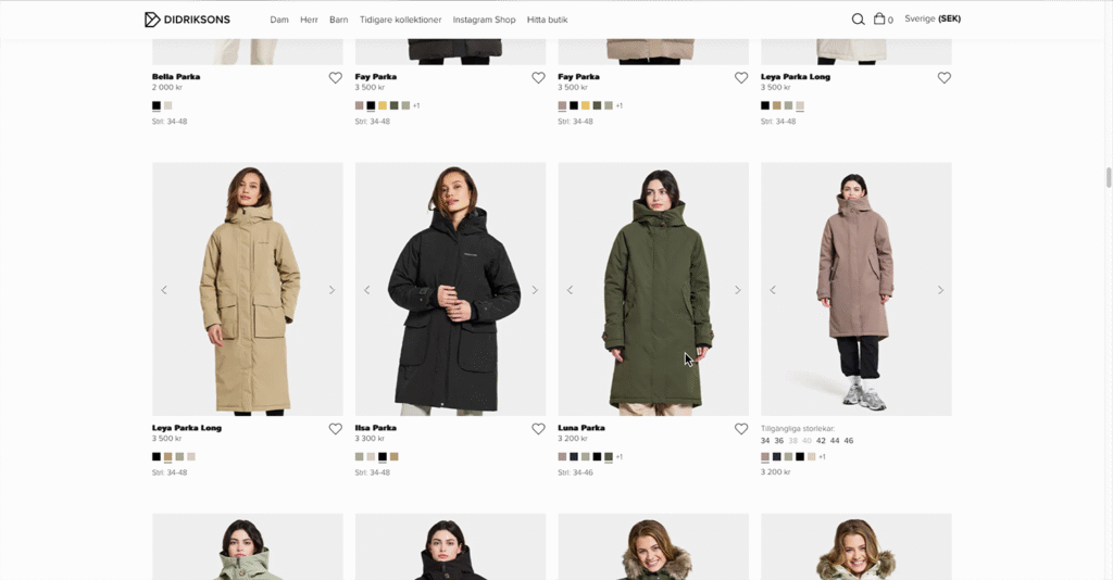
Website primarily displays jackets
All focus is on jackets, hard to find other clothing categories.
Severity: Minor
Searches disappear
The previous search disappears whenever filter options are used.
Severity: Major
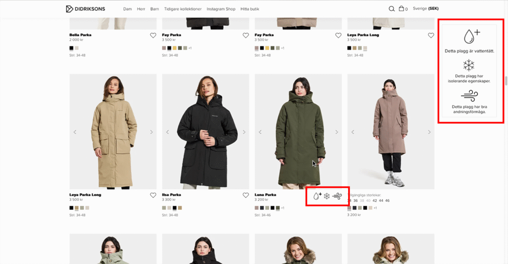
Hidden information
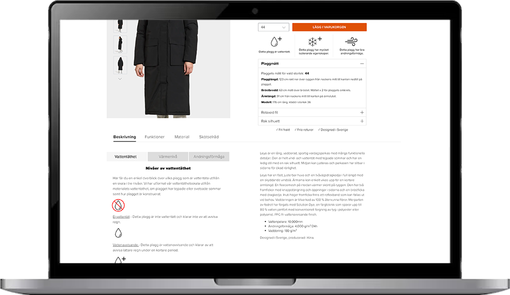
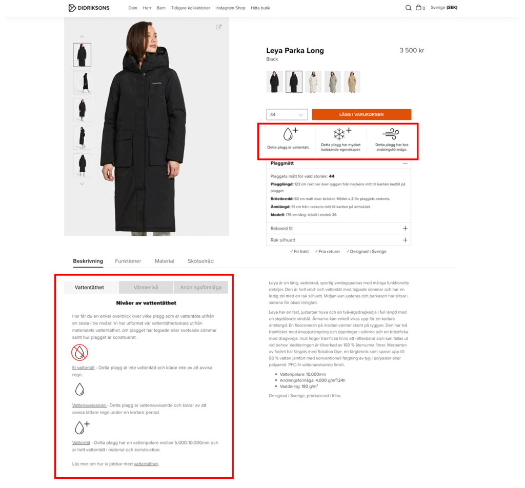
Require “read more” for waterproofness, warmth level and breathability.
Severity: Major
Results
The designs created were meant to reduce cognitive load while also increasing clarity and transparency. The suggested changes included redesigned icons that more clearly indicated whether a garment possessed a feature or not and which level, improved placement of feature information, and previews of said features directly in the product listing.
Although the project was carried out by four students, contributions were evenly balanced. I, together with another team member, focused more on the design work in Figma and Photoshop, drawing on our expertise in navigation and tool usage within these programs. However, idea generation took place collaboratively during brainstorming sessions, which strengthened the overall outcome of the project.
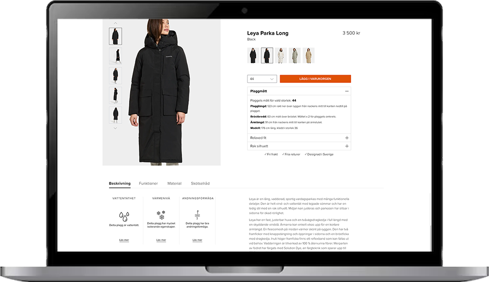
The product page’s appearance and the design proposal
The focus was on making information about the features available immediately when the user clicks on a product, and ensuring that the user would not need to click more times than necessary.
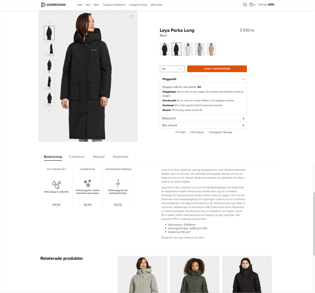
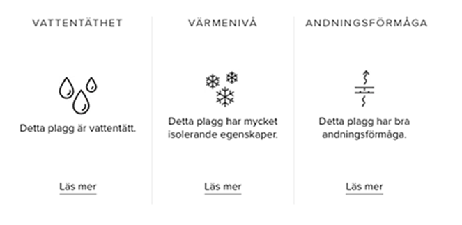
The product listing page appearance and the design proposal
An additional design proposal was to make the features viewable directly in the listing view, so that users would not have to click on a product to see the information. This change would save time and make the experience more efficient.
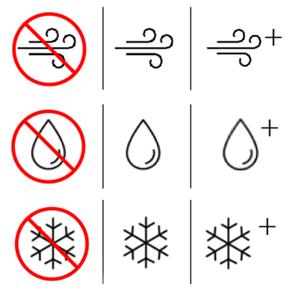
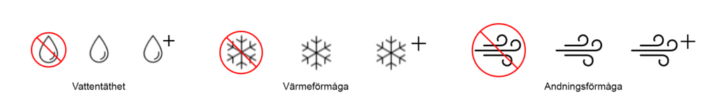
The symbols design proposal
The changes make the design more consistent. Once users understand that the plus sign means a feature is better with it than without, it becomes easier to interpret the other symbols. Before, each symbol had its own way of showing feature levels, which initially was more confusing.